CS2413: Web Site Development
WSD07:
Pacific Trails Resorts - MobilePrint

Objectives:

Point Value:

Specifics:

Text Pages: Chapter 7
Downloads: None
Reference: Silent Video on YouTube.com which is a demonstration of the completed assignment. Disclaimer: If you see something that is contradictory to our class assignments, please ask. Do not assume that since it is on the video that it is 100% correct.

Sample assignment video: Pacific Trails Resort - Mobile/Print

Color Chart: There is also a color chart to help with color names and numbers.
Errata Sheet:Chapter Updates for Chapter 7
    In the new window, click on Chapter 7 and then scroll to the bottom of center column to locate Chapter Updates.

The following is a modification of the Pacific Trails Resort case study assignment located on pages 363-366 of your textbook. Follow the instructions as indicated below for this assignment:

Pacific Trails Resort Case Study

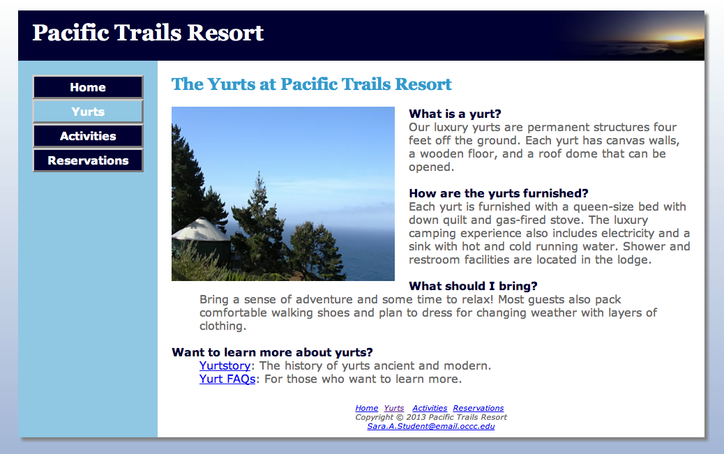
See Chapter 2 for an introduction to the Pacific Trails Resort case study. Figure 2.38 shows a site map for the Pacific Trails website. In this case study, you will configure the website to display on mobile devices using the single-column layout shown in Figure 7.17 P 329. There will also be a print version for each of the pages. You will create media queries for both the mobile and print versions, modify the desktop styles; and update the Home, Yurts, and Activities pages. Use the Chapter 6 Pacific Trails website as a starting point for this case study. When you have finished, the pages will look as shown below.

Desktop Mobile Print


Pacific Trails Screen
Tablet SmartPhone Pacific Trails Print


Pacific Trails Tablet


Pacific Trails Phone
Click on an image to see a larger version
  1. Create a new folder for this Pacific Trails case study.
  2. Modify the Home page to target mobile and print versions and deliver appropriate style sheets.
  3. Modify the Yurts page to be consistent with the Home page.
  4. Modify the Activities page to be consistent with the Home page.
  5. Modify the desktop style sheet (pacific.css).
  6. Modify the pacific.css and code a media query for a tablet device..
  7. Modify the pacific.css and code a media query for a smartphone device.
  8. Modify the pacific.css and code a media query for a print version.

Hands-On Practice Case
Task 1: Make a copy of the pacific06 folder. Rename the copy pacific07. All work for this assignment will be done on the files in the new pacific07 folder.

Task 2: Modify the Home page: Open index.html in a text editor. Edit the code as follows:

  1. Configure a viewport meta tag that configures the width to the device-width and sets the initial-scale to 1.0 .
  2. The Home page displays a phone number in the contact information area. Wouldn’t it be handy if a person using a smartphone could click on the phone number to call the resort? You can make that happen by using tel: in a hyperlink. Configure a hyperlink assigned to an id named mobile that contains the phone number as shown below:

       <a id="mobile" href="tel:888-555-5555">888-555-5555</a>

    But wait a minute, a telephone link could confuse those visiting the site with a desktop browser. Code another phone number directly after the hyperlink. Code a span element assigned to an id named desktop around the phone number as shown here:

       <span id="desktop">888-555-5555</span>

    Don’t worry about the two phone numbers that are now on the page. You’ll configure CSS in future tasks to show the appropriate phone number (with or without the telephone link) to your website visitors.
  3. Wrap the text links at the bottom of the page in a <div> tag with an id of navBottom. This will be used for displaying the links on the screen version but not on the mobile or print versions.
  4. Add support for versions of Internet Explorer earlier than IE9. Add the following code just before the closing </head> tag.
  5. Save the index.html file. It should look similar to the web page in the Chapter 6 exercise (except for the temporarily displaying two phone numbers) when displayed on a desktop browser.
  6. Remember that validating webpages can help you find syntax errors. Test and correct this page before you continue.

Task 3: Modify the Yurts page. Open yurts.html in a text editor .

    1. Add the viewport meta tag in a manner consistent with the Home page.
    2. Change the links at the bottom so that the actual URL does not appear on the page, only the link. Be sure the links still open in a new window. Also add the following short description for the Yurt FAQ page: For those who want to learn more.

      Yurts Links
      Pacific Yurts in Chrome

    3. Wrap the text links at the bottom of the page in a <div> tag with an id of navBottom. This will be used for displaying the links on the screen version but not on the mobile or print versions.
    4. Save and test your new yurts.html page in a browser. Use the HTML and CSS validators to help you find syntax errors.  

Task 4: Modify the Activities page. Open activities.html in a text editor

  1. Add the link element and viewport meta tag in a manner consistent with the Home page.  
  2. Wrap the text links at the bottom of the page in a <div> tag with an id of navBottom. This will be used for displaying the links on the screen version but not on the mobile or print versions.
  3. Save and test your new activities.html page in a browser. Use the HTML and CSS validators to help you find syntax errors.  

Task 5: Modify the Desktop CSS Open pacific.css in a text editor.

  1. Remember the telephone number hyperlink you created in Task 2? Add to the CSS coding for the <main> element code to configure the CSS for the phone number display as shown.
  2. #mobile{display:none;}
    #desktop{display:inline;}

  3. Save the pacific.css files. Use the CSS validator to help you find errors.
Task 6: Configure the Tablet CSS Open pacific.css in a text editor.

Edit the style rules as follows:

  1. Comment and code the media query to select the typical tablet device viewport size, such as

    /* ********************************************************************
                              Tablet Media Query
    ******************************************************************** */

    @media only screen and (max-width:1024px){
    }

  2. Code the following new styles within the media query
    1. Configure the <body> element selector with margin and padding set to 0. Set the background-image property to none.
    2. Configure the wrapper id selector. Set the width to auto, min-width to 0, margin to 0, and box-shadow to none.
    3. Configure the <h1> element selector. Set the margin to 0.
    4. Configure the <nav> element selector. The mobile layout uses a single column. Set the float to none, width to auto, and padding to 0.5em.
    5. Configure the nav li selector. Set display to inline-block.
    6. Configure the nav a selector. Set the padding to 1em.
    7. Configure the <main> element selector. Set padding to 1em, left margin to 0, and font size to 90%.
    8. Configure the <footer> element selector. Set left margin to 0.
    9. Configure the navBottom id. Set display to none.
  3. Save the pacific.css files. Use the CSS validator to help you find error.
Task 6: Configure the Smartphone CSS Open pacific.css in a text editor.

Edit the style rules as follows:

  1. Comment and code the media query to select the typical smartphone device viewport size, such as
    Note: The text recommends @media only all . However, using all resulted in images being not being displayedin the print version on some browsers (example: Chrome). Therefore, "screen" is recommended.

    /* ********************************************************************
                              Smartphone Media Query
    ******************************************************************** */

    @media only screen and (max-width:768px){
    }

  2. Code the following new styles within the media query
    1. Configure the <h1> element selector. Set the height to 100%, font size to 1.5em, and left paddingto 0.3em
    2. Configure the <nav> element selector. Set padding to 0
    3. Configure the <footer> element selector. Set left margin to 0.
    4. Configure the anchor tags in the navigation area. Code a style rule for nav a selector. Set display to block, padding to 0.2em, andfont size to 1.3em. Also configure the bottom border to be 1 pixel with a color of #300.
    5. Configure the nav ul selector. Set the margin and padding to 0.
    6. Configure the nav li selector with a block display. Set the margin and padding to 0. Set the font size to 0.85em.
    7. Configure the <main> element selector. Set top and bottom padding to 0.1em, right padding to 0, and left padding to 0.4em.
    8. Configure the main img selector to not display. Set display to none and right padding to 0.
    9. Configure the main ul selector to use list-style-position as outside.
    10. Configure the <footer> element selector. Set padding to 0.
    11. Configure the navBottom id. Set display to none.
    12. Remember the telephone number hyperlink you created in Task 2? Configure the CSS for the phone number display as shown.
    13. #mobile{display:inline;}
      #desktop{display:none;}

  3. Save the pacific.css files. Use the CSS validator to help you find errors

Task 7: Configure the Print CSS. Open pacific.css in a text editor

Edit the style rules as follows:

  1. Comment and code the media query to select the typical print device

    /* ********************************************************************
                              Print Media Query
    ******************************************************************** */

    @media print{

    }

  2. Code the following new styles within the media query
    1. Configure the <body> element selector. Remove the blue gradient background image.  
    2. Configure the <h1> element selector. Set the top and bottom margin to 0.
    3. Configure the <nav> element selector. Set the display to none.
    4. Configure the <footer> element selector. Set left margin to 0.
    5. Configure the <main> element selector. Its width should be based on the entire webpage since there will no longer be navigation at the left. Set the width to 90%,
      padding left
      and right to 10px,
      padding top and bottom1px,
      margin left and right to 10px
    6. Configure the <a> element selector. Set text decoration so the text is not underlined and the text color is #000 (black)
    7. Configure the main a selector. Set it so that the URLs are printed in parenthesis after the text link using a 0.9em font. (see p. 315 #9 for a similar but not exact example.)
    8. Configure the wrapper id. Set the background color to #FFF (white), minimum width to 0, and width to 95%. Remove the box shadow, modify the border so that it is thin solid and #000 (black),
    9. Configure the navBottom id. Set the display to none.
    10. Configure the <footer> element selector. Set left margin to 0.
  3. Save the pacific.css files. Use the CSS validator to help you find errors.

Final Steps:
Publishing:
FileZilla upload the entire pacific07 folder to your Apollo web site.

Desktop Version:

Tablet Version:

Smartphone Version:

Print Version:
It is recommended that Print Preview or Preview as PDF be used to save paper and printer ink/toner.

Common Requirements for All Web Pages

    1. The web pages must display correctly in all of the following: FireFox, Chrome, Safari, and Internet Explorer.
    2. The links between the existing pages with the Pacific Trails Resort website cannot be broken.
    3. All HTML and CSS code must be well documented, properly indented, and easy to read.
      http://css-tricks.com/examples/CleanCode/Beautiful-HTML.png
      http://coding.smashingmagazine.com/2008/05/02/improving-code-readability-with-css-styleguides/

Mandatory Requirements

Failure to adhere to and/or include the following items will prevent the assignment from being graded.
Note: If time permits, the assignment can be resubmitted during the late/resubmit period, but there will be a 10% penalty.

    1. No additional formatting is allowed at this point in time only what is outlined in the text.
    2. All pages must include DOCTYPE, <meta> tag, and <html> tag information.
    3. The link to the web page in the submission area of the LMS must open the homepage in a new browser window.
    4. All web pages must validate (HTML5 and CSS) without errors using the Web Developer Tool Bar in FireFox or Google Chrome.
      Validate for CSS3.

Assignment Submission:

There are two parts to submitting the assignment: uploading the website to the Apollo server and submitting the URL within the LMS.